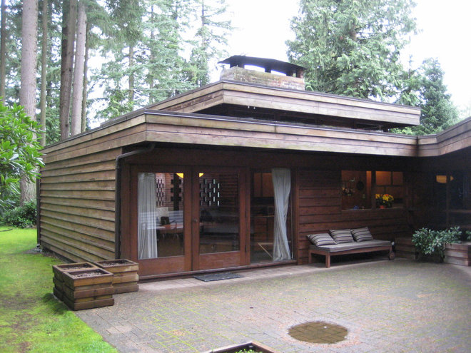
Sixty years is a long time for a house to go without
some remodel love. That’s what a Vancouver lawyer faced when she
excitedly snatched up this angular midcentury modern gem designed by
notable local architect Fred Hollingsworth.
The home had not been touched since it was built in 1952. Sure, she could have gutted the place and started from scratch, but the Hollingsworth-loving homeowner wanted to take a preservationist approach. Besides, the home had heritage status, and any changes would have to be approved by a committee. The challenge, then, was finding an architect who appreciated the architecture as much as she did.
Enter designer Ken Best of Synthesis Design. He’d already remodeled two other Hollingsworth homes, one of which was his own. The two instantly connected and embarked on keeping Hollingsworth’s baby intact, while giving it some much-needed love.
Houzz at a Glance
Who lives here: A lawyer
Location: Vancouver
Architect: Synthesis Design
Size: 1,886 square feet; 2 bedrooms, 2 bathrooms
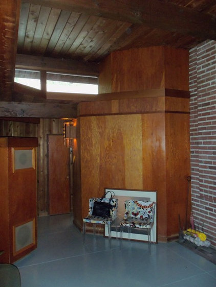
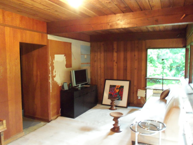
The entire interior
of the house was previously clad in plywood and tongue and groove
paneling. Neither was in great shape, and some of it had water damage. “It was yellowing and looked like a very old garage,” Best says. “It was such a time capsule.”
Best was able to keep some of the original materials, though, and credits contractor Warren Wilson with skillfully matching new materials with the old.
Best was able to keep some of the original materials, though, and credits contractor Warren Wilson with skillfully matching new materials with the old.

AFTER: A brick fireplace is a central focus of the ranch-style home. Best
believes there were two main reasons for Hollingsworth’s abundant use
of 45-degree angles. For one, the architect was captivated by geometry.
(He designed other houses based on circles.)
More generally, he designed houses as responses to their site. Set back from the road, with houses on all three sides, and no real view of mountains or water to focus on, this home uses angles to maximize views to the surrounding landscaping, promoting an indoor-outdoor feel. “There are a lot of layers, but when you’re in the home, it doesn’t feel jumbled,” Best says.
The wooden framework to the left of the fireplace near the ceiling was kept in place for structural and aesthetic reasons (there would have been gaps in the tongue and groove ceiling that would have been hard to match), but it also helped bring more light into the core of the home. The space below the framework is a closet/mudroom.
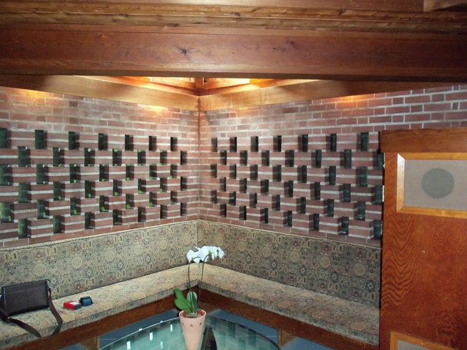
Playing with horizontal bricks
was a trademark of Hollingsworth’s that the homeowner wanted to
highlight. The banquette upholstery, however, she could do without.

AFTER: Best racked his brain trying to figure out how to get the wired glass windows out and insulated. In the end he left them. They give a sense of obscured movement, shapes and light.
The concrete floors had radiant heat installed in the ’50s, but it had long stopped working. Instead of ripping up the old floor, Best poured a new slab with a radiant heat system right on top. (Yes, they lost an inch and a half of headroom.)
The concrete floors had radiant heat installed in the ’50s, but it had long stopped working. Instead of ripping up the old floor, Best poured a new slab with a radiant heat system right on top. (Yes, they lost an inch and a half of headroom.)

All the posts and beams are fir. The ceiling is cedar. Best
had to pull out the soffit boards to install up-to-date lighting. The
raised cupola pulls in light and views of the surrounding tree canopies.

Three wood sconces designed by Hollingsworth are original to the house. “It’s
such a signature piece to the house; everyone took special pride in
seeing them repaired and put back in place,” Best says.

The built-in bookshelf
is also original, but Best removed it when the team poured the concrete
and had to modify it slightly because the space lost a little height.
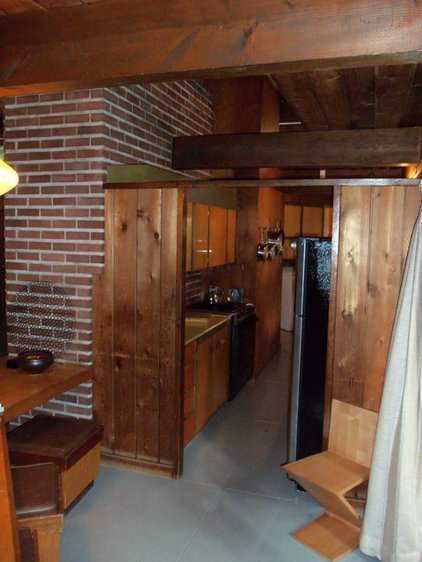
The original kitchen
was completely wrapped in wood. Typical of kitchens built in that era,
it was meant to be closed off from the living space.
At the time, Best says, it was actually innovative for there to be not a door but partial walls, so guests could see into the kitchen from the dining room.
At the time, Best says, it was actually innovative for there to be not a door but partial walls, so guests could see into the kitchen from the dining room.

AFTER: The kitchen was gutted and modernized with new walnut cabinetry, new appliances and quartz-based countertops.
An original peninsula table (with original stools) extends from the fireplace. “It’s kind of this Usonian idea to make use of built-ins as much as possible,” says Best. “I’m not sure how practical it is, but they’re a common feature of houses in that era.”
An original peninsula table (with original stools) extends from the fireplace. “It’s kind of this Usonian idea to make use of built-ins as much as possible,” says Best. “I’m not sure how practical it is, but they’re a common feature of houses in that era.”
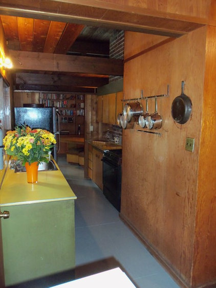
Even the original pots and pans had been left behind in the house.

AFTER: Eclipse windows above the sink fold away to create an open pass-through with bar seating on the other side. “The patio takes on a whole new function in warmer months,” Best says.

One of Best’s main goals was to establish more physical access to the outdoors. In the home office, he added two sets of doors to make better use of a side yard, to which there was previously no access.
Given the nature of the structure, there wasn’t a cavity in the ceiling to add lights or wires to, so the team created this bulkhead over the desk to bring in six pot lights. This room was designed to allow the homeowner to easily add walls and a door to turn it into another bedroom.
Given the nature of the structure, there wasn’t a cavity in the ceiling to add lights or wires to, so the team created this bulkhead over the desk to bring in six pot lights. This room was designed to allow the homeowner to easily add walls and a door to turn it into another bedroom.
The backyard previously felt disconnected from the interior.

AFTER: The new bar
completely transformed the feel of the house. All the windows were
replaced with double-pane ones for better insulation.
A small den in the back of the house was dark and dated.

AFTER: Best cleaned
it up, adding a bit of drywall and a gas fireplace. This is where the
homeowner likes to hang out, watch TV and read.

The designer also added new walnut shelves. The millwork panel on the left hides a piano. The door leads to the main bedroom and a new en suite.

The back of the house was completely reconfigured and pushed out to accommodate this new en suite off the main bedroom. A cedar slat wall outside encloses a private garden accessed only through the door seen here.

A new skylight floods the marble-wrapped shower with sunlight.
More: Photos of 2013: The Most Popular Midcentury Modern Spaces
More: Photos of 2013: The Most Popular Midcentury Modern Spaces
+ نوشته شده در یکشنبه سیزدهم بهمن ۱۳۹۲ ساعت 19:11 توسط محمدفشارکی
|
 چون در فروشگاه پدرم مشغول به كار هستم تصميم داشتم بعنوان خدمات جنبي به مشتريان و سازندگان ساختماني و مديران پروژههاي عمراني ، خدمات خاصي براي استفاده از نوآوريهاي ساختماني بدهم ( زيرا ما بصورت موروثي جزء فروشندههاي لوازم بهداشتي ساختمان و مصالح هستيم ) ولي اينكار نياز به برنامه و مديريت پيچيده اي داشت كه مرا از انجام وظايف ديگرم در فروشگاه باز ميداشت لذا تلاش كردم با راه اندازي يك گروه اينترنتي به مخاطبين خودم آخرين دستاوردهاي طراحي و انواع ديزاين را ارائه بدهم اما مشكلات فراوان ( خصوصا" نوع اطلاع رساني ) اجازه نميداد ولي در این وبلاگ سعي ميكنيم بعد از ناكامي در ايجاد گروه اينترنتي ( بدليل مشكلات مربوط به خودش ) آخرين نمونه هاي طراحيها و ديزاين جمع آوري شده از فضاي نت را براي شما عزيزان قرار بدهيم تا زحمت وبگردي را برايتان به حداقل برسانم در حال حاضر به تنهايي اقدام ميكنم اما تلاش دارم اينكار را با همكاري بعضي ديگر از دوستان به حد كمال برسانم به هر روي اگر كاستي در انجام اين وظيفه مشاهده نموديد ، ما را از راهنمائيهاي خودتان بي نصيب نگذاريد